As Oakwood prepared to celebrate its seventy-fifth anniversary, one big question loomed: How could this milestone feel unmistakably Oakwood? The answer wasn’t just found in a standard “75” logo; it began with the people who make Oakwood what it is every day. This belief sparked an ambitious idea. What if Oakwood’s students had a literal hand in shaping the school’s visual identity?
The result is Oakwood 75, a one-of-a-kind typeface built from thousands of characters handwritten by Oakwood students.
One of the defining ideas in Oakwood’s Statement of Philosophy is balancing “seriousness of purpose with a sense of play.” That productive tension became the inspiration for the school’s anniversary identity. Since 2012, Oakwood’s primary typeface has been Brandon Grotesque, a geometric, modern font that conveys clarity and structure. For the seventy-fifth anniversary, the team wanted something that complemented Brandon while expressing the other side of Oakwood’s personality – creativity, warmth, experimentation, and joy.”We had the seriousness of purpose,” shared Oakwood’s Director of Marketing & Communications, Bret Nicely. “We were looking for that sense of play.”
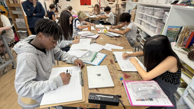
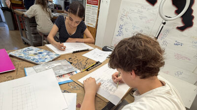
The ideal partners in this search emerged in Madeline “Mads” Zygarewicz, along with their Middle and High School design students. These 7th, 8th, and 9th-graders were already studying typography, branding, and visual identity. In middle school Intro to Principles of Design class, students had just begun exploring how typefaces and fonts can communicate mood, feeling, and personality. In high school Art + Design, students had also been examining the signage they encounter around campus, experimenting with creating and manipulating typefaces, and designing “Font Vibes” posters around a favorite quote or motto.
Scanning thousands of characters to create a typeface that reflects the personalities, abilities, perspectives, weirdness, creativity, intellect, rigor, and individuality of our community is such a beautiful idea
Mads Zygarewicz
The Oakwood 75 project became a natural extension of that work, allowing students to apply what they were learning to a real-world design challenge. “It was awesome to have such a meaningful real-world connection where students had a direct hand in a design project our entire community would experience,” Mads shares. “The timing aligned so naturally with what we were already teaching.”
Over three workshops, students completed custom handwriting templates that included the full alphabet, numbers, and selected phrases. Together, they produced more than 100 pages of handwriting and over 3,000 unique characters. Those handwritten letters became the foundation of Oakwood’s 75th anniversary identity.
Working with Oakwood’s design partner, Distinc_, the team digitized, curated, and transformed those individual characters into a fully functioning typeface available in both regular and bold weights.
One of Oakwood 75’s most distinctive features is that nearly every letter has multiple versions. Rather than relying on a single “A” or “O,” the typeface includes four or five variations of each letter, each drawn from a different student’s handwriting. In practice, when someone uses the Oakwood 75 typeface, they can choose among those variations, giving every phrase or slogan its own personality. The result feels alive, improvisational, energetic, and human.
The student collaboration didn’t end once the handwriting had been digitized. When the first versions of the typeface were ready, the students gathered again to review multiple design directions. They discussed how the letters worked in different words, different colors, and different weights, offering feedback that helped refine the final product.
Mads was surprised by how successfully the first version of the typeface captured the overall feel of Oakwood students. “Initially, one of my middle school classes was almost evenly split between the light, medium, and bold variations, which I saw as a testament to how well the design captured the diversity of our community.” Their input influenced decisions about everything from which letterforms felt strongest to when to use different font weights.
In many ways, students helped establish not only what Oakwood 75 looked like, but how it would be expressed throughout the anniversary year. They played a central role in creating something living that showcases the energy and individuality students bring to campus every day. “Scanning thousands of characters to create a typeface that reflects the personalities, abilities, perspectives, weirdness, creativity, intellect, rigor, and individuality of our community is such a beautiful idea,” says Mads. “It feels like a perfect expression of Oakwood’s student-driven philosophy—something that might seem small on the surface, but is actually incredibly thoughtful and meaningful.”